GT - Exploration of Novel Visualizations for Information Security Data - Roni Choudhury & Brian Wyli
Show transcript [en]
good afternoon thank you so the alternative title to this talk is zombies bubbles and machine learning and hopefully that will make sense later okay so as as Mike said I'm Brian Whaley I'm from killer Inc so KITT where there's a lot of open source projects so if you've ever used C make you've used KITT where software they do they're involved in mini field satellite medical and they're spinning up now an information security group so we'll be releasing open source software through that process so I love open source I love mixed corgis they're just so cute they just get them it's the big dog and a little dog bite so the Ronnie chera dairy is not here he helped me with some
of the presentation materials his a background in visualization of course he also loves open source and for some bizarre reason he's neutral on mixed quarries okay so a little bit of expectation management for this talk so we you know it's labeled as a fist talk we we took the we took the the term explorations seriously and so we kind of just like decided okay what would be cool what inspires us and also the talking ended up having a little bit more machine learning than perhaps I expected okay so what's the best way to visualize security data I'm not sure well look at a couple of existing examples that are that are popular in the community and then we'll look at a
few inspirations and then a couple of demos okay so everybody in the audience is probably familiar with the ELQ stack so it's elasticsearch log stash in Cabana and so Caban is the visualization part of the kind of web interface to that open source stack they have kind of a cool way of making dashboards so you know in elk and cabana you can specify oh I went kind of these panels set up in these ways and and then you can kind of set up the visualizations you can do very similar thing in Splunk so so lots of good traditional but visualizations maybe not crazy about the pie charts but so I wanted to give it a call out a big shout
out to SEC Business org so Raphael Marty has been involved in both the security community and the visualization community for well over a decade and he maintains this this website and so it's a community oriented website you know a bunch of examples of security visualization and he's he's giving a black heck flat hat talk on visual analytics this year and the site has a really good kind of diverse set of examples but most of them are graph oriented and so you know we wanted to we wanted to kind of do something different so we didn't want to do graphs because those have been done to death we kind of kind of shied away from the traditional
visualizations so there's a lot of good resources when you're thinking about doing a new visualization and I just wanted to call out some of the kind of fundamental places to go so Edward Tufte gets a lot of visibility and people have probably heard about him she's great I definitely recommend you know reading the Tufte books and going to his website a couple of ones that I did want to call out that a publisher so John rouser gave a terrific talk at velocity Amsterdam on how humans see data and if you'll really want in-depth kind of kind of become a formal quantitative way around the different techniques and the different pros and cons associated with the different
techniques and there's an old paper but a great one by William Cleveland called the elements of graphing data and this also treats you know the different categories of visualization and the use cases in a very formal way and they have a kind of in-depth user studies and things like that but we didn't do any of that we were looking for inspirations so I kind of want to lark we said okay well you know how can we get creative here so I like bubbles I like zombies so we tried to combine visualizations with bubbles and zombies so our first inspiration was something called organic visualization so Finn fry from the MIT Media Lab has a web page and a lot of
publications focused on what he calls organic design so it's about visualizing and processing kind of streaming data you know what does it look as it grows how does it get organized what do clusters look like how does it evolve and this movie by Pedro Cruz is a good exemplar for some of the some of the principles talked about by pan-fry so here it's a movie about visualizing Empire declines and it happens to be 1800s maritime empires and so we're looking at looking at Portuguese Spanish French and British maritime empires and you're kind of seeing the tension that happens that as time goes forward and how these how these empires has split up and kind of degrade and and eventually
collapse into I just thought that was a great visual EEGs and that kind of inspired me right could felt kinetic you kind of kind of felt like oh wow there's this tension within the organization and then it explodes apart so that was our first inspiration second inspiration is what we loosely call zombies it's really the visible human project so this is a scientific visualization project and what they did is they took two human cadavers so they took a male cadaver and a female cadaver they froze them and a big block of ice and then they sliced them ever so so thinly 2,000 slices approximately and they took high-resolution images of each of those slices and it generated a lot
of data and a lot of the the user interfaces you know they would have kind of the human sitting there and then they'd have this widget that where you kind of did a cross section you cut across at a certain part in the in the cadaver and it would show you kind of the cross section at that part and in this space so we we tried to emulate that kind of interface for for our exploration okay so as I mentioned you know there there may be turned out to be a little more machine learning here than I than I expected so I kind of want to go through you know we tried a couple of
techniques where we visualized kind of like categorical and numerical data kind of on raw feels like we're looking at DNS and HTTP requests and it just wasn't that effective so you know we're we're working on these data analysis and machine learning pipelines in fact this is this is part of this kind of information security thrust that kitware is doing so we have you have several activities happening one of the ones that's that's going out right away is this project called bro thon so it's basically taking bro IDs and kind of making the bridge into Python and then bridging from Python to pandas and then pandas to scikit-learn so so you know you can go go to github and you can look
up growth on we're going to be giving a pro/con talk to about that and so this this is kind of good as an overview of where kitware is going so we're going to provide a set of components and libraries so the the first this top phase here it's really about getting all of the kind of raw network data into a data frame and it could be the pandas dataframe our spark data frame so and then once you're in a data frame you have this whole kind of a great set of you know stats and filters and groupings you know visualizations and plots I'm in fact all the visualizations you'll see today are kind of based off of our usage of data frames
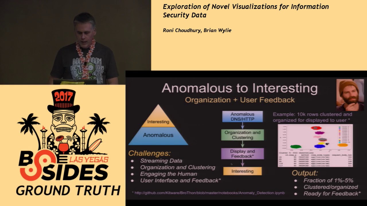
and then if you're going to use I could learn that's kind of this additional step of going from a data frame to a numpy array and so growth on has a set of classes where I can just hand it a data frame and it can have both categorical and numerical types and all of that encoding is handled for you as you go into an umpire rate and then and then and then once you're in an umpire array you have this great world of scikit-learn that you can kind of leverage all these really advanced machine learning techniques okay so so first the first visit we did is kind of based off of an anomaly detection and in
my experience anomaly detection when people first start using it they're really excited like okay you know I'm gonna have all my data I'm gonna run my anomaly detection and get something great what ends up happening is you set the whole system up you run it and you you turn a huge pile of data into a small pile of data and you still don't know what you have and so we call anomaly detection kind of Basecamp so it's all you can really say about anomaly detection you can't really say anything specific about the anomalies but you can say something reasonably solid around things that aren't anomalies you can say that this is common data you can say that this is
normal data and I can in many cases kind of discard that very early in the pipeline so we we discard that first part out of the pipeline and this is the way we do it and specifically for this use case we use bro-bro thon we ship that data directly from bro logs it does this kind of this dynamic tailing ships it into a data frame and then like I said we use the classes that that's flipping into a numpy matrix and then we use isolation forests so isolation forest is really good machine learning algorithm because it handles kind of the high dimensionality associated with you know as you as you take like things like DNS
data that have categorical types in these are details but as you do one height encoding that can that can lead to quite a few dimensions and so this is a good technique for that and then once we have the anomalous data you know again that's only a base camp so we want to get to interesting so getting to interesting really means organizing and grouping the data in a way that's human consumable so I take my big pile of data to turn it into a small pile of data and I organize that small file okay and this is what it looks like so this is you know in in the github repo we wanted to kind of provide
examples for everything and so this is a small small use case here but in this case particular we ran a bunch of HTTP requests from bro I ran it through an the anomaly detector and then ran it through a clustering engine so for clustering we use there's several streaming clustering method make it mechanisms so we use mini-batch k-means we use DB scan and we use a high report DB skin so here this kind of what the results look like on this case we had four clusters this cluster again kind of toy data but this came out because the the method here for the HTTP request was the options method instead of the more normal get or post and here this cluster
came out because the there were body links were exceptionally long for this destroy dataset this one had a uncommon response mime type and this one happened to be on a DAT instead of port 80 so none of these are bad but there's but it's kind of showing you what you get when you take away the normal and then organize what's left I mean and all this is available through the sai Pathan notebook so you can just go to here and it's literally like 10 lines of Python okay so so I wanted to give a demo before I give a demo so the the engine is d3 so we use d3 as a back-end kit where has this
candela framework and it kind of does this nice thing where kind of takes a bunch of d3 code kind of encapsulated it encapsulate sit into a chart and you can kind of just use that chart so you can go to kill board candela and see this kind of thing alright so here's the demo I'll start this going the data will start streaming in I kind of we just wanted to share this anomaly notebook while we're at it so so again lots of comments lots of images here but really only about you know 10 train lines of Python and and you get all the same thing so you know normally we would kind of filter away the normal here but
we for this demo we just left it so I can I can speed this up and so what's happening here is data is coming in anomalies are being identified and then being presented kind of in the display and so here you know we kind of talked about this emulating the visible human so the idea here is you kind of slice through the data here and then this is showing you the clusters as we go and so like like here what we can do here is maybe look at some of the clusters like okay well what's in this cluster oh it's because they're using the TCP protocol instead of UDP and like what's in this cluster oh I see the Z bit here is one
reserved Z bit should be zero maybe more interesting like okay okay look at this I can see oh these are really long these are really long query lengths and maybe you know it's doing data X bill or something and so this is the this is a toy data set but you know this works on real data so we run this at kitware all the time so you know care was not a huge place but we took a reach 100k dns log of just normal keyword traffic and then we injected a peak cap of malicious traffic and we joined the see what you know again all this codes available on that notebook we didn't make any changes you
know is the is this anomaly thing going to identify weird or anomalous stuff and so this is the result so I'd identified out of 104 Cairo zve then if I'd 5k roads that were outliers the first cluster had 851 observations and happened to be that it's because the borough IDs hit the rejected flag on this and this happened to be just a weird server configuration so the ID IT guys were actually happy that I found this and and so this was not malicious anyway but but indicated something that we needed to look at so this is this is a little circuit I injected traffic here from a known malicious thing does anybody know what this is
anybody seen this enough to know what tool this popular toolkit that might be bluish alright kobold string so so this is cool ball strike stage download so what's happening here is I have kind of normal size query length but then I have a really big answer link so Cobell strike is doing in the stage download and again we didn't make any changes to the code here so this is all just popped popped right up out of the anomaly detection this is cobalt strikes exfil so very long query length meaning I'm exfilling data and then the answer link is very short so this came out as an as well this this third cluster brew does this thing where like if it can't
figure out class names and type names just put these dashes in so this was the the dashed fields as a categorical type where were marked as an anomaly and this last one I don't know is does anybody know what this last one is has anybody seen this so it's the ESET endpoint security product so it'll actually use DNS text requests to get your reputation scores and so it's it's using the DNS on your on your thing is kind of like a tunnel it's perfectly just legitimate but again it's one of those things that just came up okay so then the second example is we were we were enthusiastic and inspired about bubbles so we did one
more Bowl kind of clustering diagram and this one we did on sis logs so sis logs are a complete mess it's because they're totally unstructured I mean there are there's a lot of work on parsing sis logs in this case we just said screw it we're not going to do any parsing take the syslog and blast it through a similarity engine so we use something called local locality sensitive hashing and this kind of minimizes the number of comparisons you have to do so the thing with with similarities is yep is you don't want to do too many comparisons so running out of time I'll put these slides up so the idea here is that you
take the syslog you tokenize it and then and then you can get the similar system log messages so you can see here that the guy gave us a high similarity and then you know these these two systems that are far apart in the log are extremely similar okay and so then let's do more this okay so so this is again the d3 vis this one you can as you kind of hover you can kind of see like oh these are these are kernel messages so you know this is a bunch of kernel messages will to Apple these are kernel messages related to sleep and then if i zoom out here so again this is all this is all
time grouping this entire kind of meta group is associated with google chrome so my google chrome is throwing a bunch of syslog messages and then these are all the sub clusters associated with google chrome okay so I think I'm good on time and I think I'm done actually so I just wanted to make sure that we didn't run out so time for questions and or what in the heck was that frozen [Applause] after you did anomaly detection you remove the normal thing and then cluster the interesting yes so that's all historical data now if I want to do like which all those clusters were really interesting versus this is not and how do I do it
on a continuous stream of data so the question was you know how do i how do i mark the clusters as kind of interesting or not interesting right and so I didn't you know I didn't have enough time that was a little more ml but we have a recommender system that we're working on and so the idea is this kind of like Pandora and so you look at a cluster and you say oh not interesting down arrow you know that cluster is interesting up arrow and then that the recommender system then kind of tracks that and then prioritizes those clusters and the visualization but this is something that will yeah new new traffic we've got one
more quick question over here and then we gotta call it okay so I'll touch base yeah I was looking at that visualization it's pretty cool would it be you think it'd be possible to use it for maybe suggesting new syslog types if you introduced a whole new system of type similar to an existing you know Linux kernel or authentication event that you could you know label or suggest a new event like to get you could you see it used for that possibility that's a great suggestion they basically it's like okay well if I have assist law if I have an event that comes in that's 99% similar to an existing event then maybe you should just suggest hey you
know if you're similar to this we're very straightforwardly yeah it's good suggestion okay we would like to thank Brian Wylie for his wonderful presentation
Related talks
 51:51
51:51 32:48
32:48 33:48
33:48 54:33
54:33 31:06
31:06 20:51
20:51